VietCharm — Homepage & Booking Flow

Overview
VietCharm is a cultural dining show in Vietnam offering a curated experience of traditional performances and cuisine. Despite a premium product, the existing website felt outdated and failed to communicate the brand's value — leading to high drop-off at the booking stage.
Objective
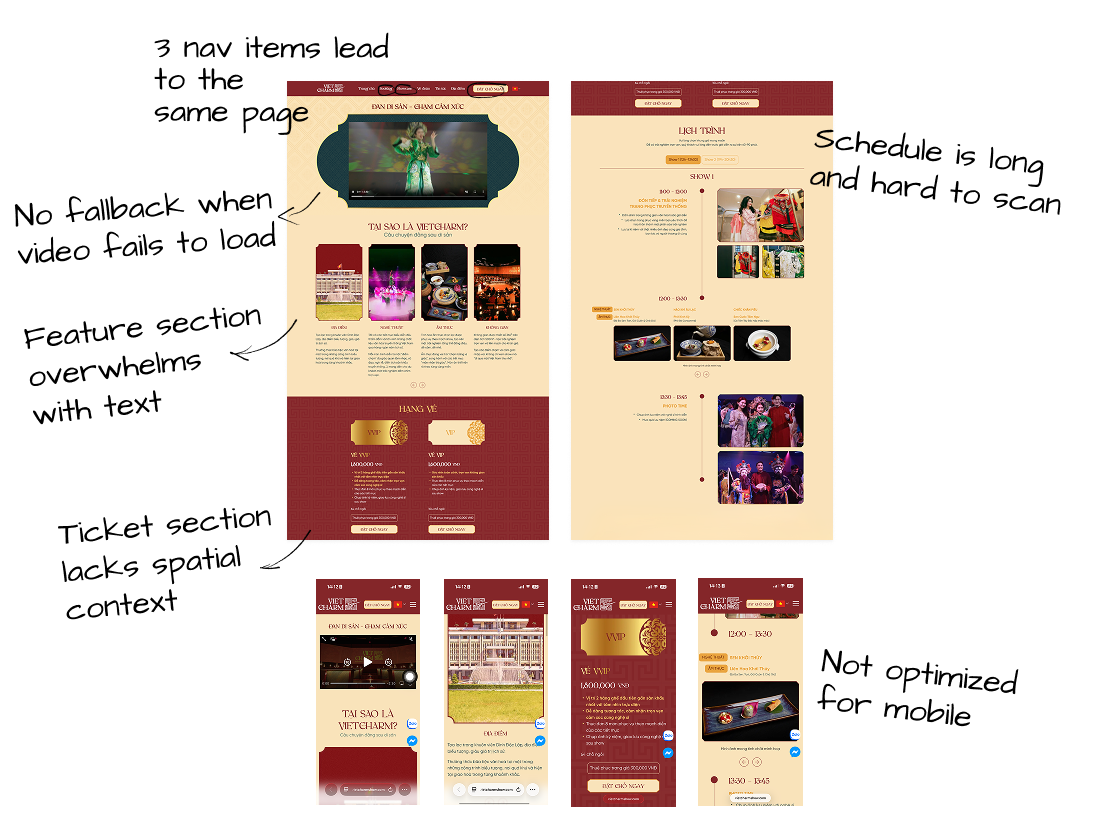
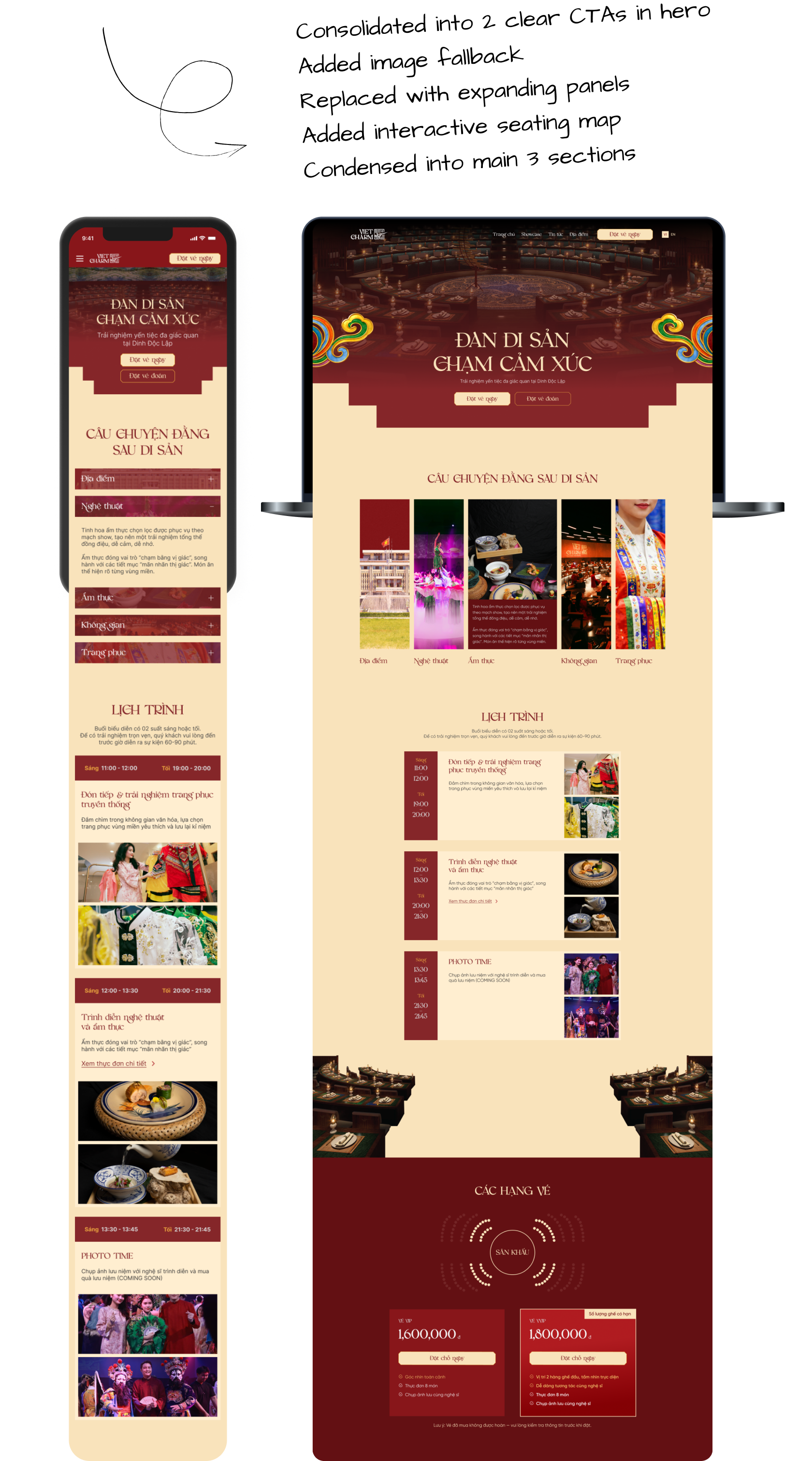
Homepage
Problem
The homepage made it hard for users to find their way and make confident decisions.
Outcome
Clearer navigation and visual decision reduce hesitation, keeping potential buyers engaged long enough to convert.
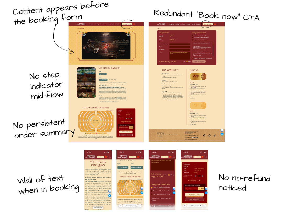
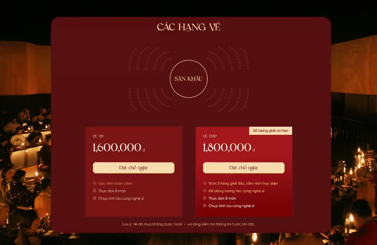
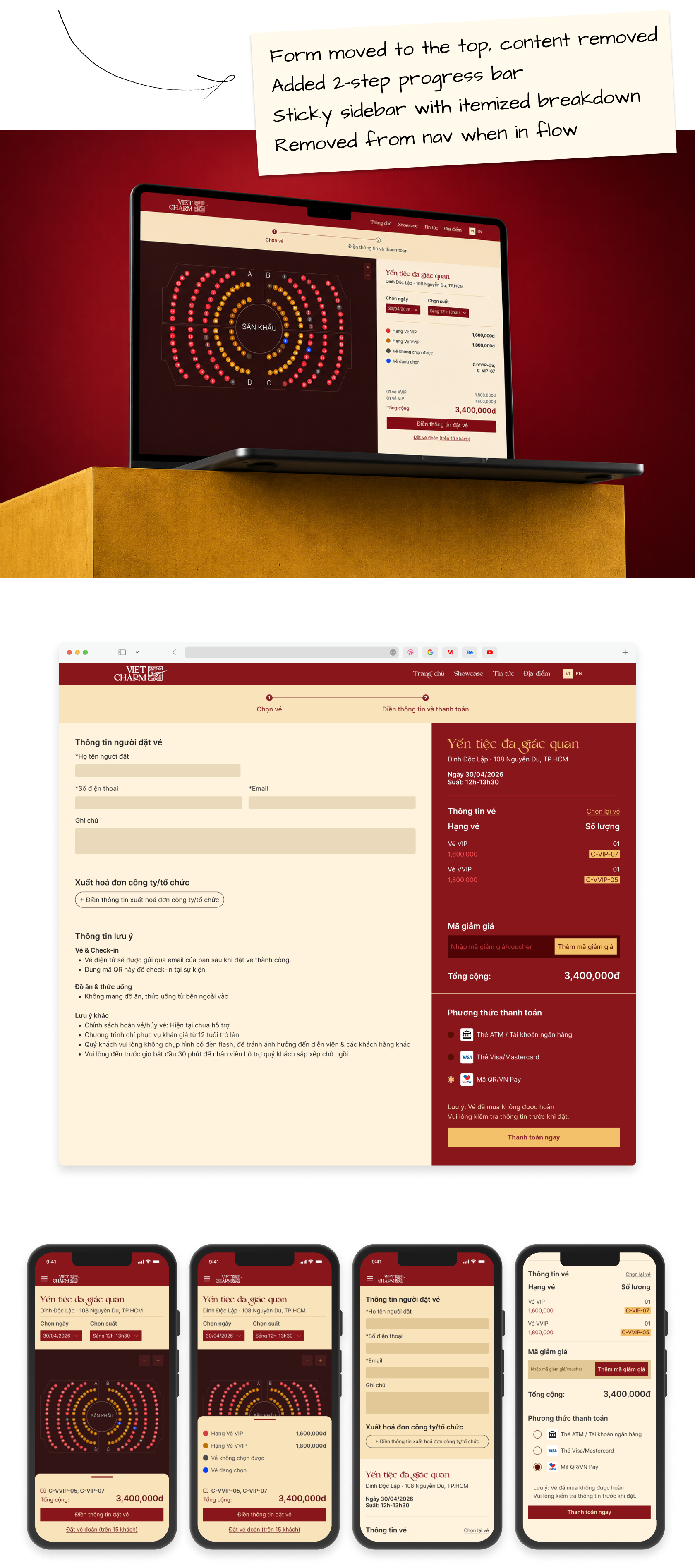
Booking
Problem
Booking flow has unnecessary friction at the point of highest purchase intent.
Outcome
Fewer steps, persistent order visibility, and trust signals at checkout lower abandonment at the highest-intent.
Challenge
Date access limited
The biggest challenge was the lack of real user data. Without analytics, recordings, or interviews, it was difficult to identify genuine UX issues and avoid relying on personal assumptions.
My approach
I conducted the audit from a first-time user's perspective and validated findings using established UX frameworks such as Nielsen's Usability Heuristics and Baymard's checkout research. Any issue that couldn't be linked to a recognized usability principle was excluded, ensuring the audit remained objective and evidence-based.
Problem analysis
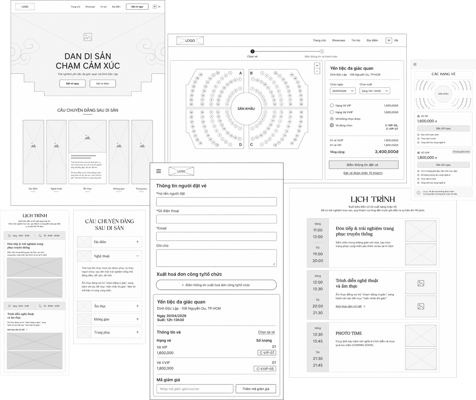
Design solution
Wireframe
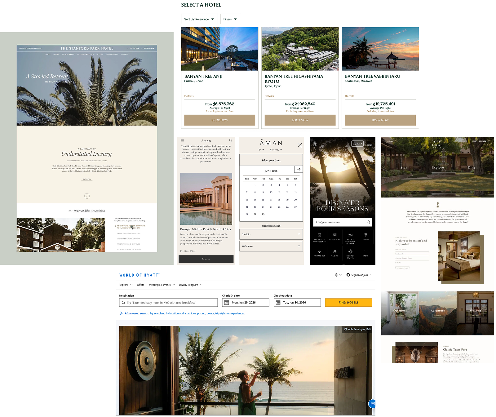
Design References
Homepage
Booking
What's next
If I had more time, I'd validate these decisions with real users, particularly first-time visitors arriving from social ads, to confirm whether the changes actually reduce friction or surface new ones I haven't seen yet.
Let's solve a problem